To produce the magazine advert we used Adobe Photoshop to edit a picture on ourselves onto our chosen background. This editing package made it easier for use to cut, crop and manipulate the images in order to produce our final magazine advert.

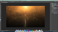
 Firstly we went online and downloaded a background cover from Google images. We wanted to make a portrait poster so we had to change the rotation of the image and we did this by changing the scale. We used the 'content-aware scale' tool as it got rid of any unwanted space without changing the picture size.
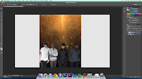
 In a different window we cut the image of ourselves and changed the opacity. This was because we decided to include a watermark of an image so that we didn't look plain in the actual advert.
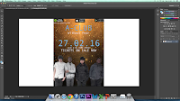
Next we took the image that we had previously cut out and placed it on top of the background. Lastly, we imported the 'Spotify', 'itunes' and 'Google play' logos and lined them up at the top to make the advert look official.

After looking at other magazine adverts we decided to add our website at the top underneath the media outlets. We kept the consistency with the text and made sure that we put the bands name in big font as well as the day we were performing our new album. The name of the album appears underneath the band name.

No comments:
Post a Comment